By: Kayla Sirlin ’19
The time is running out and I’m approaching the final problem on a math test. I anxiously crunch numbers into my calculator while simultaneously thinking about the next steps necessary in order to complete this complex problem. “One minute left!” my teacher warns us, and with this, a wave of stress passes through my body. Outside, the clouds open up so that light pours into the classroom through the large windows spanning across the wall. Suddenly, it all comes back to me. I scribble down all ten steps, finishing just seconds before the bell rings. Phew.
Although many factors affect one’s concentration and overall work caliber, colors can affect us in ways we didn’t even think were possible. The importance of the colors surrounding us, although greatly under prioritized, can either be detrimental or helpful to our learning in the classroom.
The International Association of Color Consultants of North America (IACC-NA) believes, “many cases of irritability, premature fatigue, lack of interest and behavioral problems can be attributed directly to incorrect environmental conditions involving poorly planned color and lighting.”
Yasu Wade, one of the school’s social workers, agrees with this claim. “The bright lighting is intense sometimes and may cause students migraines, which can take away from their learning and participation,” Wade said.
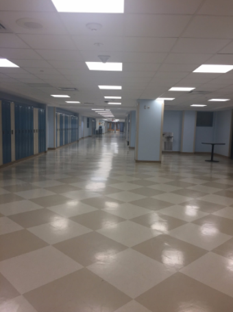
Looking at the color choices in Staples, students have expressed varying opinions. The baby blue and light yellow paint covering the hallway walls has proven controversial, as some hate it and others love it. Personally, I believe the light tints are easy to look at and make passing through the crowded hallways less stressful.
Taking the first side is Sydney Panzer ’19. While she believes the colors undoubtedly help with educational purposes, she admits that the visual appearance is displeasing.
“I don’t like the yellow blue color scheme in the hallways. I’m pretty sure those colors were never meant to be mixed,” Panzer commented.
Conversely, Chloe Emilio ’19 commented on the purpose of the colors and airiness of the school by stating, “I think the colors are mellow for a reason, and I enjoy my classes more when the room is more open and airy with natural light. The lightness of the walls helps in giving this airy effect.”
Emilio’s preferences are backed up by scientific evidence, and also convey how I feel towards the topic. Research on the specific impact of the color blue has concluded that it prompts a higher level of creativity, that cannot be generated otherwise.
“…For creative tasks such as brainstorming, blue environmental cues prompted participants to produce twice as many creative outputs as when under the red colour condition,” Science Daily, a website that specializes in science research, found in their studies.
In an already cut-throat environment, where students are fighting to keep their 4.0 GPA’s and are taking multiple AP’s, it’s nice to know that our school is designed to fit studious needs.
In order to maintain the amount of success Staples students achieve on a daily basis, windows should be not be shaded and posters/distracting colors should be kept to a minimum.
Smith System concurs with this goal and stated that, “The key to creating an environment conducive to learning in a classroom is to not over-stimulate learners.”


