People love Facebook.
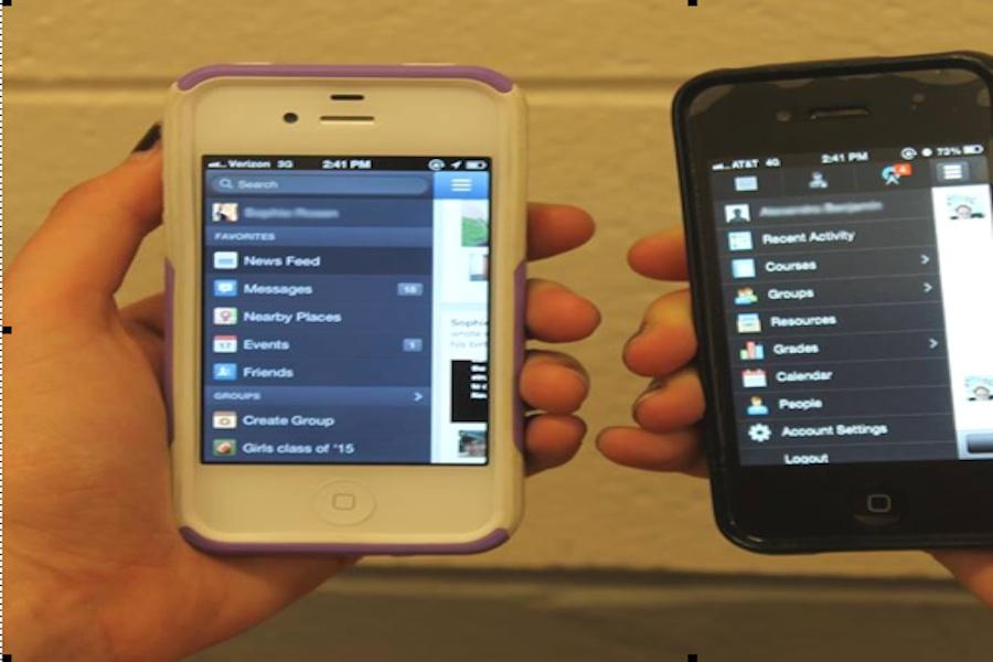
People love its groups, messages, and notifications. However, Staples students have recently been introduced to its twin, Schoology.
Actually, its evil twin.
Unfortunately, students have come to realize that Schoology is the evil twin of Facebook.
Students now dread those elements that they love most about the popular social media site.
So, instead of notifications alerting people of requests to join Farmville or to play Candy Crush or comments on the newest funny vines (Have you ever heard of, “This is Gary. Gary has social anxiety”?), students now get notifications that 4,786 notecards for their research paper are due in an hour, or that they must read 14 chapters of Realidades Tres for Spanish Three Honors, or that they need to pack their schoolbags to the brim with their huge A.P. bio textbooks.
It’s a problem. With almost all of the features on Facebook duplicated on Schoology, including friends requests and actual iPhone notifications, there is only one word to describe it.
Awkward.
Students across the school say they feel the same way.
“I think being able to message your teachers over some informal system and being able to send messages to other teachers across the school is weird,” Kenji Goto ’16 said.
It’s not only awkward, but some of the features on Facebook that have been added to Schoology are quite ironic. Whenever a teacher posts homework, a reminder about an essay, or the date of a test, Schoology gives all of the users an option to “like” the post.
While I am a very studious worker, I don’t “like” it when I have a unit test on every rebellion stemming from the French Revolution the next day.
If anything, there should be a dislike button.
So Schoology is awkward and ironic. But hey, Schoology hasn’t taken cover photos yet, so let’s just enjoy those while we still can.
