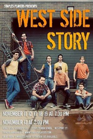
Staples Players will be presenting a production of West Side Story, to show on Nov. 11, 12, 17, 18, and 19 at 7:30p.m.The poster to advertise the show recently made its Facebook debut. Kerry Long, photographer and creator of the poster, as well as wife of David Roth, the director of Players, gave Inklings an inside look into what it took to put together the vibrant advertisement.
Q: What do you try and achieve when you make posters for the Staples Players’ shows? What elements of the shows do you like to use in the posters?
A: We like to try and do posters that reflect our specific production of each show – and, since I am a photographer, often this includes photos of some of the cast members. The students love to be included in the poster and it often makes for something a little more eye catching then just the standard logos that are usually used for shows.
Q: What is reflected in the poster of West Side Story? How did you get this across?
A: For this poster I knew that I wanted to do a portrait of the Jets (one of the gangs in the show). West Side Story may be a love story, but it’s also really the story of this group of young men and the turmoil in their lives. The show is set in New York City, in the 1950’s, so obviously a location was difficult to find. I drove all around Norwalk and Westport looking for a good spot – unfortunately for us there are not too many run down or urban looking places in Westport!
When it came down to it, we were running out of time and had to take the photo at Staples – fortunately we found a great location and were able to pull some props out of our storage to make the setting look a little more urban. I knew that I wanted to use a staircase or ladder to be able to get some different levels for the guys and had a couple of other props in mind to give the guys some different heights.
Q: What is it like to produce a poster like this one?
A: The boys got into costume for the first time and we arranged them on our little poster “set” – luckily the guys were great models and seem to understand the look that I was going for. A lot of the students really love the reflection of one of the students, Daniel Greenberg ‘14, in the puddle in the lower right corner – one of those little “happy accidents” that happen with photography… It happened to have rained earlier in the day!
Q: What steps do you take in producing it?
A: I knew ahead of time that I wanted to put the title of the show in the upper right corner, so I made sure that the photo was composed to leave space there. I made some changes in the color on my computer and highlighted the boys’ faces using some Photoshop actions and added the text – we used orange and yellow text to tie the text in with the colors of the Jets’ costumes.
Q: What have been some reactions to the poster?
A: The students really seem to like the poster and I’m so happy that it has been well received!






















Sarah • Feb 6, 2012 at 8:47 pm
terrific article and beautiful poster, how did I not see this before… “Riff” looks amazing in the middle.. I saw the show, it was fabulous, and this poster is GREAT! Love “Action” at the bottom!